 Drape Haus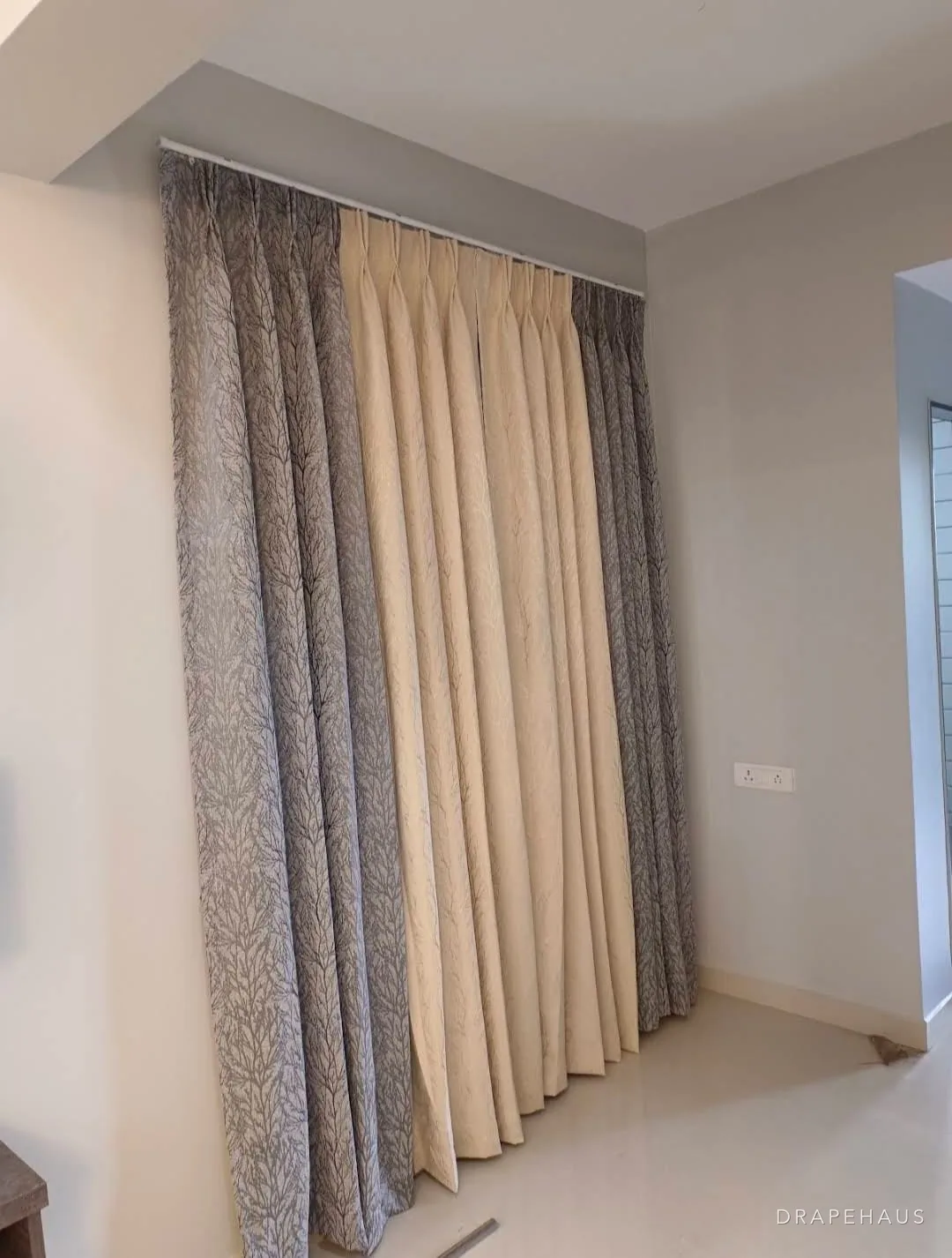
The right curtain colour for a living room is usually found on the floor and the sofa, not on a paint chart. Those two are the largest areas of colour you will keep for years, so start there: pick a curtain that sits comfortably with both, decide whether it should blend with the walls or frame the windows, and then check it in your own light, at three times of day, before ordering.
A living room adds three things a bedroom does not. It usually has more openings, often a sliding door as well as windows, so the curtain becomes a large share of what you see. It is seen at every hour, from bright morning to lamp-lit evening with guests. And it is seen from outside, from the road and the neighbours, when the lights are on. In Goa it also faces strong sun for half the year, which decides which colours last.
Our general guide on how to choose curtain colour covers the method for any room. This one is about the living room in particular: anchoring, pairings of sheer and drape, pattern, fading on sunny openings and testing, with four typical Goan rooms worked through. You can preview colours on your own window in the curtain simulator.
Anchor the colour to the floor and the main sofa
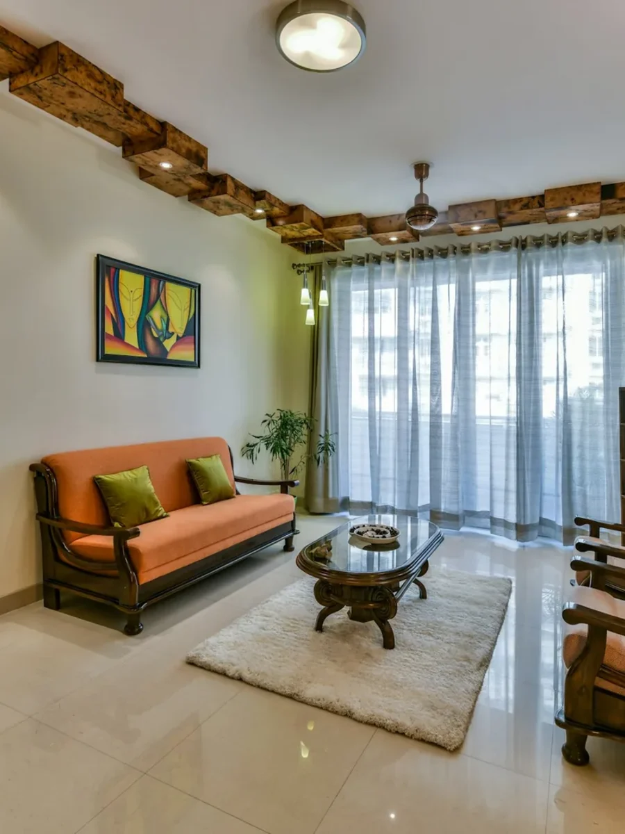
Walls can be repainted in a weekend. The floor and the main sofa stay for ten years or more, and together they are most of the colour in a living room. Choose the curtain to sit with those two, and the walls and cushions can change around it without the curtains looking wrong. Our page on living room curtains covers the fabrics and linings we use for Goan sitting rooms.
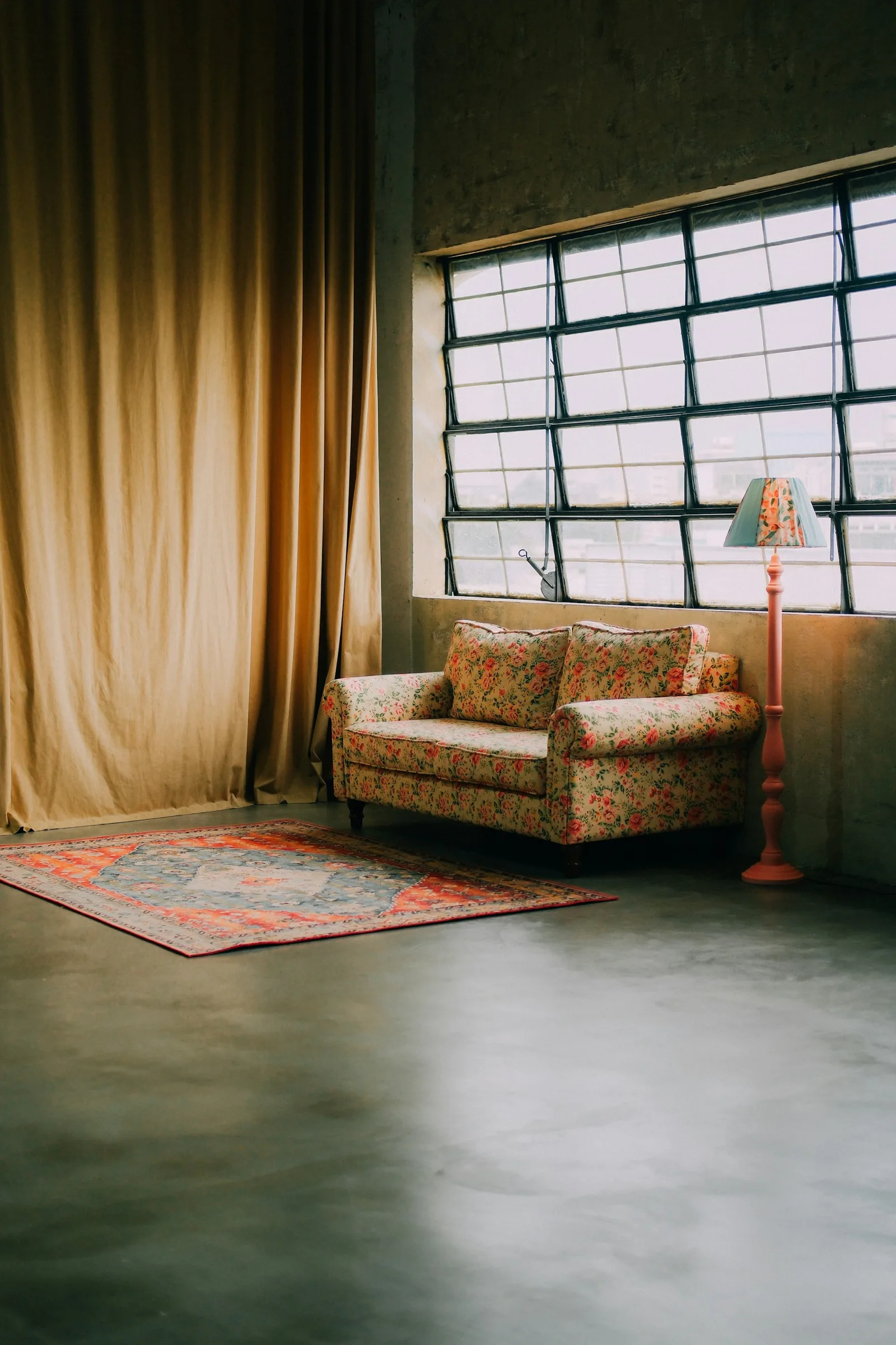
The floor gives you the undertone. A red oxide or terracotta floor is warm and strong: curtains with some warmth in them, from oat and sand to rust and ochre, sit with it naturally, while icy greys and lilacs tend to fight it. Beige or cream vitrified tiles, now common in Goan flats, are a quiet warm neutral and accept almost anything, but they look flat beside a cold white curtain. Grey or charcoal stone and dark oxide floors are cool and make deeper colours look richer. Patterned cement tiles are already the room's pattern; take the curtain from their background colour.
The sofa gives you the second note. A plain, mid-toned sofa leaves the curtain free to carry a colour or a pattern. A strongly coloured or patterned sofa wants a quieter curtain, often a shade from its lightest tone. The rule that saves most rooms is simple: do not match the sofa exactly. A curtain a step lighter or darker than the sofa, or in a neighbouring colour, looks chosen; an exact match looks like a set.
- Red oxide or terracotta floor: oat, sand, rust, ochre, olive, warm indigo
- Beige or cream vitrified tiles: warm whites, stone, sage, clay, soft blue
- Grey stone or dark oxide floor: slate, deep green, ink blue, crisp ivory
- Patterned cement tiles: a plain curtain in the tiles' background colour
- Strongly coloured sofa: a quieter curtain from the sofa's lightest tone
Matching the walls or contrasting with them
Once the anchor is settled, there are two broad routes for the walls. A curtain close in tone to the walls lets the windows recede, so the room reads as one calm volume and the furniture and view lead. A curtain that contrasts with the walls turns each window into a frame and gives a plain room structure.
In a living room, count the openings before choosing. A room with one large window or a single sliding door can take a contrasting curtain well: one strong rectangle on a wall gives the room a focal point. A room with four or five openings, perhaps two windows, a sliding door and a door to the balcão, becomes busy with contrast, because every opening shouts. There, a curtain within a shade or two of the wall, given interest through texture, keeps the room settled.
Sightlines matter in open-plan rooms. If you can see the living-room curtains and the dining-room curtains from the sofa, they belong to one view and should be the same colour, or two closely related ones. A separate study or a family room off the main space can have its own scheme. A University of Kentucky extension guide on window treatments lists tone-on-tone solids in interesting textures that mix well with other fabrics among popular choices, and that is the quiet answer for many multi-window living rooms.
Planning something like this?
We visit homes across North and South Goa, measure on site, and bring samples to see in your own light.
Four Goan living rooms, worked through
The table shows how the anchors play out in four common living rooms. None of these is the only answer; each is a starting point that follows from the floor, the sofa and the number of openings. Notice that in every case the sheer and the main curtain are chosen together, because in Goa most living-room windows carry both.
Two patterns run through all four. The sheer is usually a warm white or ivory rather than optic white, because it is backlit by the sun for hours and a cold white looks blue against warm floors. And the stronger colour, when there is one, goes on the room-side curtain, where it is lined and away from the glass.
| Room | Fixed anchors | Main curtain | Sheer |
|---|---|---|---|
| New flat, west-facing balcony door | Cream vitrified tiles, white walls, grey sofa | Warm stone, lined, a step darker than the walls | Ivory voile |
| Heritage sala | Red oxide floor, lime-washed walls, teak furniture | Oat linen; or rust if one strong colour is wanted | Natural or ecru linen-look |
| Sea-facing villa, wide glass | Pale stone floor, white walls, white sofa | Soft blue-grey textured weave on a white-backed lining | Warm white |
| Rented flat, walls can't change | Beige tiles, landlord's off-white walls, own sofa | Taken from own sofa or rug, so it moves with you | Ivory |
How Goan daylight changes curtain colour compared with a showroom
Daylight is not one colour. The Canadian Conservation Institute gives typical colour temperatures of about 6,000 K for noon sunshine, 9,000 to 12,000 K for blue sky and about 3,000 K for late afternoon light, and around 3,000 K for a warm-white lamp. A lower number looks warmer and yellower, a higher one cooler and bluer. That is why the same fabric looks cool and slightly grey in a north-facing room lit by the sky, crisp at noon, and golden on a west-facing sliding door at five o'clock.
Goa exaggerates the swing. The India Meteorological Department's climate summary describes skies as generally clear or lightly clouded from November to April, and six to seven eighths covered from June to September. A curtain chosen in the bright dry season will look duller and greyer through the monsoon, and one chosen on a grey August day can look much stronger in December. Showroom lighting is a third condition again, often bright and cool. Judge a fabric only in the room where it will hang.
Your lamps matter too. The Institute rates light sources by colour rendering index, with 90 to 100 counted excellent and 80 to 89 good, and notes that daylight and ordinary incandescent lamps both score 100. Lamps lower on that scale show some colours less faithfully, so a curtain can look quite different under them than it did by day. If your living room is used mostly in the evening, choose the curtain under the lamps you actually have, or replace them with high-CRI lamps before deciding.
Late-afternoon sun and warm lamps both sit around 3,000 K: a west-facing living room looks warmer at five o'clock than it did at noon.
Colours and dyes that fade least on south- and west-facing openings
The living room's sliding door and its biggest windows usually take the longest hours of sun, and the curtains on them fade first. The Canadian Conservation Institute groups colourants on the ISO Blue Wool scale, from grades 1 to 3 (highly sensitive) through 4 to 6 (medium) to 7 and above (low). Its table shows that in average daylight of about 30,000 lux for eight hours a day, a highly sensitive colour can show a just noticeable fade in a day to two weeks, a medium one in two weeks to a year, and a low-sensitivity one in six months to ten years. The colour name tells you little; the dye and its grade tell you most.
So on the sunniest openings, ask for the fabric's lightfastness grade, and favour fabrics dyed for outdoor or contract use, including solution-dyed fibres where the colour is in the fibre itself. Mid-tones and woven textures hide what fading does happen, because a slightly paler mid-tone still looks like a mid-tone, while a saturated plain colour fades in visible stripes along the folds facing the sun. A sheer drawn in front of the glass through the afternoon takes the direct light first.
A lining does the most work for the least money. A 1950 American curtain-making manual already advised lining draperies on sunny exposures when the fabric was not sunfast, because the lining could be renewed and add years to the face fabric. A white or light lining also helps with heat: the US Department of Energy cites studies in which medium-coloured draperies with white plastic backings cut heat gain by 33%. Choose the colour you want facing the room, and let a light lining face the sun. Our guide to fading and sun damage goes deeper into fibres and dyes.
| Light sensitivity | ISO Blue Wool grade | Just noticeable fade |
|---|---|---|
| High | 1–3 | 1 day to 2 weeks |
| Medium | 4–6 | 2 weeks to 1 year |
| Low | 7 and above | 6 months to 10 years |
Curtain colour combinations: sheer and drape, two-tone and borders
Most Goan living rooms carry two curtains on each main opening, a sheer for the day and a lined curtain for the evening, so the real question is often a colour combination rather than a single colour. The sheer is seen with the sun behind it and tints the light in the room; the main curtain is seen mostly open, framing the sheer, and fully when drawn at night. Choose them as a pair, on our layered curtains principle.
Three pairings work reliably. Tone-on-tone puts an ivory sheer behind an oat or stone curtain, so the window looks soft and calm and the change between day and night is gentle. Contrast puts a white sheer behind a deep colour, indigo, forest green or rust, so the open curtains frame a bright window strongly. A patterned main curtain with a plain sheer lets the pattern lead; a patterned sheer with a patterned curtain almost never works.
Two-tone curtains and borders are the other way to combine colours. A plain curtain with a contrasting band down the leading edge, or along the hem, picks up a colour from a rug or a cushion without committing the whole curtain to it. A deeper band at the bottom can also anchor a very tall curtain in a high-ceilinged room. Because the band is a small area, it is the safest place for a strong colour on a sunny window, and it is easier to remake later than a whole curtain.
| Combination | Example | Effect | Suits |
|---|---|---|---|
| Tone-on-tone | Ivory sheer, oat linen curtain | Soft, calm, gentle day-to-night change | Rooms with many openings |
| Contrast | White sheer, deep indigo curtain | Strong frame around a bright window | One main opening, plain walls |
| Patterned drape, plain sheer | Ivory sheer, block-printed curtain | Pattern leads; light stays clean | Plain sofas and floors |
| Plain curtain, contrast border | Stone curtain, rust leading edge | Colour from the rug, in a small area | Sunny windows, rentals |
| Two-tone horizontal | Oat above, deeper clay band at the hem | Anchors tall curtains | High ceilings |
When patterned curtains work better than plains
Plain curtains are the safe default, and in a living room with patterned tiles, a strong rug, busy art or many windows, they are usually right. Pattern earns its place in a different kind of room: plain walls, a plain sofa, a plain floor and one or two main openings. There, a patterned curtain does the work of art on the wall, and it is often the simplest way to give an all-neutral room character.
Pattern also helps on the practical side. A printed or woven pattern in mid-tones disguises the slight, uneven fading of a sunny opening far better than a flat colour, and it hides the odd mark on a curtain that is drawn by many hands. If the view from a window is poor, a blank wall or a busy road, a patterned curtain gives the eye something better to rest on.
Scale it to the window. Large prints and wide stripes read well on tall openings and across a sliding door; small, busy prints look restless at full height. Vertical stripes add apparent height; a horizontal band adds weight at the hem. Ask how the pattern repeat will be matched across the widths, because a mismatched repeat is very visible on a long run. Our printed curtains page explains how we match repeats.
Test swatches at morning, afternoon and night before ordering
The University of Kentucky's guide advises getting large fabric swatches or samples for an on-location comparison before buying, and for a living room that is the step that prevents most disappointments. A thumbnail swatch under shop lights tells you very little about a three-metre curtain backlit by the west sun.
Narrow the field first. Use the curtain simulator to try colours, linings and layers on a living-room window and rule out what clearly does not work, then ask for three or four large samples. Pin each at the actual opening, ideally the sunniest one, and look at it three times: in the morning, in the late afternoon with the sun behind it, and at night with your own lamps on and the curtain closed. Look at the sheer and the main fabric together, from the sofa as well as from the door.
If a colour still looks right at all three times, it will look right as a curtain. If you are torn between two close shades, choose the slightly warmer one for a room used mostly under warm lamps in the evening, and the slightly cooler one for a room that takes hot afternoon sun. Then ask about the fabric's lightfastness and the lining before you commit. Our linen curtains come in the warm neutrals that suit most Goan living rooms, and we bring samples to your home so you can judge them in your own light.