 Drape Haus
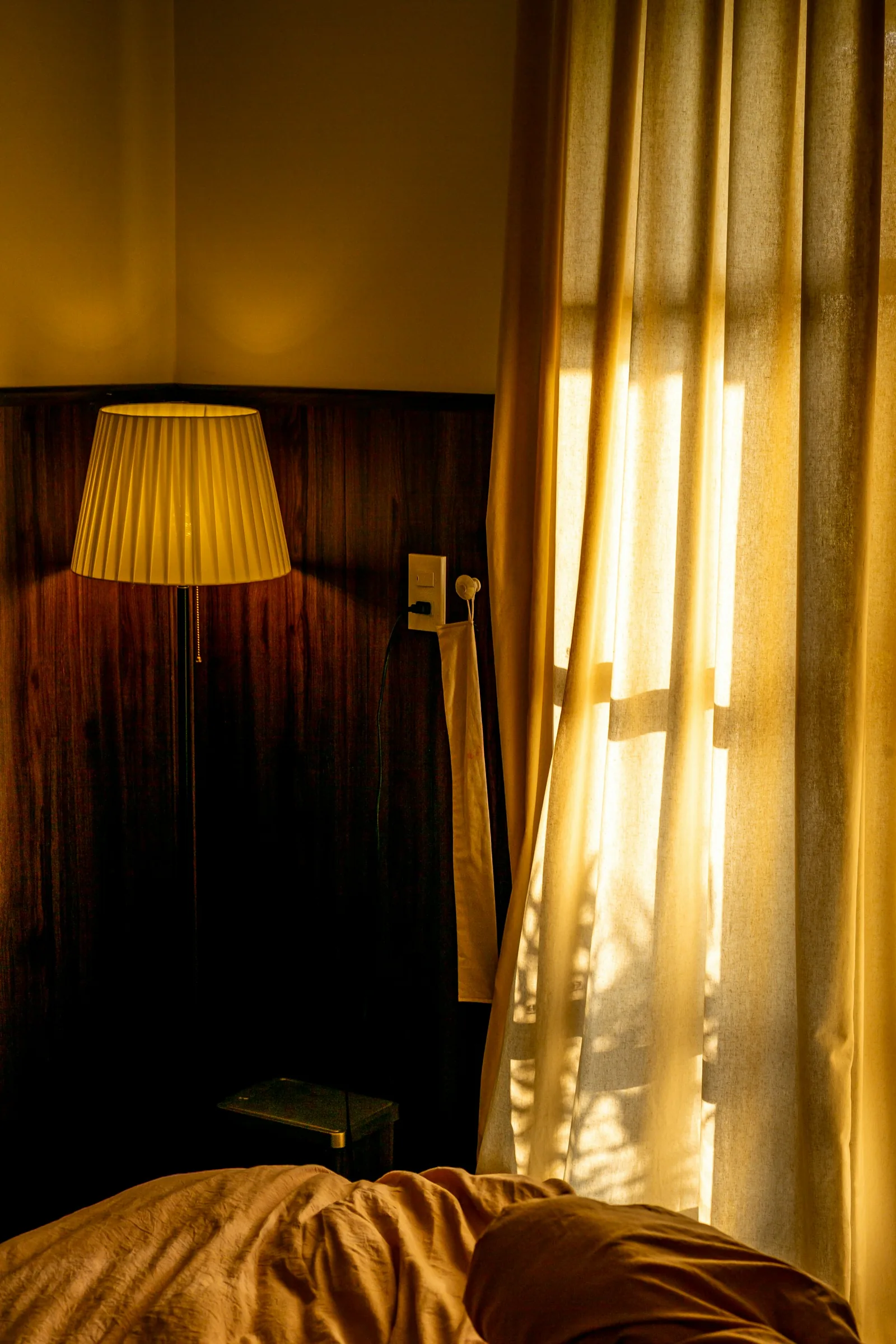
The right curtain colour for a bedroom does three things: it looks calm to you at six in the morning and at eleven at night, it lets the curtain keep the room as dark as you need, and it survives years of sun on the window. Colour on its own does not make a curtain block light. The lining does that. But colour decides how much a lightly lined curtain glows, how warm the room feels when the sun is on it, and how the window looks from the street.
For most Goan bedrooms, the dependable route is a muted, mid-toned colour taken from the bed wall or the bedding, made up with a lining that suits how dark you want the room, and backed in white or ivory so the window looks tidy from outside. Softer, greyed versions of colours tend to sit better in a bedroom than bright, saturated ones, not because of any proven effect on sleep, but because they look quieter in both morning light and lamplight.
This guide works through palettes for bright mornings, how colour interacts with blackout and heat, the street view, pairing with the headboard and bedding, and how to test samples properly at night. For the wider method, see our guide on how to choose curtain colour.
What calm means for a bedroom curtain
Bedroom colour advice online is full of claims that blue lowers your heart rate or green reduces anxiety. Some of those ideas may have something behind them, but they are usually repeated without evidence, and we do not choose curtains on that basis. What the health bodies actually say is simpler: the NHS suggests that people often find it easier to sleep in a room that is quiet, dark and cool, and recommends fully closing curtains to keep it dark. The colour that serves that is the one that stops you noticing the window at all.
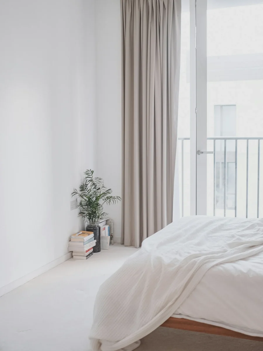
In practice, calm comes from low contrast and soft saturation. A curtain close in tone to the walls disappears when drawn; a high-contrast curtain, say deep navy on a white wall, makes a strong rectangle you see every time you open your eyes. Softer versions of colours, the greyed greens, dusty blues, clay pinks and warm stones, look restful in more kinds of light than their bright equivalents. Texture adds interest without adding colour.
Personal association counts more than theory. If a colour reminds you of a place you love, it will feel calm to you. If it reminds you of a hospital corridor, no study will change that. Start with the colours you already choose for clothes and bedding, then soften them.
- Stone, sand and oat: warm neutrals that sit with timber and oxide floors
- Sage and grey-green: soft against white walls and green views
- Dusty blue and slate: cool, good in rooms that take hot afternoon sun
- Clay, terracotta pink and muted rust: warm, and kind under lamplight
- Charcoal and deep indigo: for rooms where the curtain should vanish at night
Bright mornings: the colour you wake up to
From November to April, the India Meteorological Department's climate summary for Goa describes skies as generally clear or lightly clouded, and the IMD notes that mornings are less cloudy than afternoons. An east-facing bedroom takes that clear early sun straight on. Whatever happens at the window then happens in the first light you see each day.
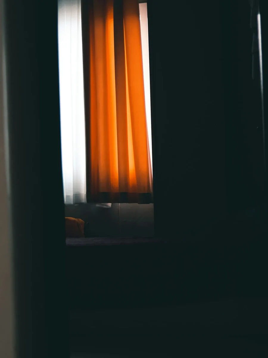
If the curtain lets any light through, it will tint the room in its own colour. A saffron or orange curtain turns the morning gold; a red one makes a white room pink; a blue or green one gives a cooler, slightly greyer light. Neutrals give neutral light. This is the most overlooked part of choosing bedroom curtain colour, and it only shows once the curtain is up and the sun rises behind it. Hold any sample against the glass at sunrise before deciding.
If you want the room dark, a blackout lining removes the question, because nothing comes through. If you like waking to soft daylight, choose a dim-out or cotton lining and pick the face colour knowing it will become the colour of your mornings. Warm neutrals and soft greens tend to give the most pleasant glow.
Planning something like this?
We visit homes across North and South Goa, measure on site, and bring samples to see in your own light.
Does curtain colour affect blackout? Only without the right lining
Colour on its own is a poor way to darken a room. An unlined dark curtain lets less light through than an unlined pale one, but it still glows at the edges and through the weave, and it absorbs the sun's heat and warms the room. A blackout lining makes the face colour almost irrelevant to darkness: a white curtain and a charcoal curtain on the same blackout lining keep the room equally dark.
The difference shows in the middle: dim-out linings and plain cotton linings. With those, darker and denser face fabrics block more, and the colour of the light that does come through follows the fabric. A deep curtain on a dim-out lining gives a dusky room; a pale curtain on the same lining gives a bright, soft one.
Heat follows the same logic. The US Department of Energy notes that a drapery's effect on heat depends on its weave and colour, and cites studies in which medium-coloured draperies with white plastic backings reduced heat gain by 33%. What faces the glass matters most. For a bedroom that takes afternoon sun, a white-backed lining lets you choose any colour you like for the room side. Our article on heat blocking curtains explains why.
| Construction | Darkness | Morning light in the room | Heat on a sunny window |
|---|---|---|---|
| Pale fabric, unlined | Low | Bright, tinted by the fabric | Little control |
| Dark fabric, unlined | Moderate, with glowing edges | Dim and coloured | Fabric heats up and radiates |
| Any colour, cotton lining | Moderate | Soft glow in the face colour | Some control if lining is light |
| Any colour, dim-out lining | High; a faint glow | Dusky, faintly coloured | Good with a light back |
| Any colour, blackout lining | Full, if fitted well | None | Good with a white back |
How the colour looks from outside
From the street, the garden or the next building, people see the back of your curtain. With a lined curtain, that is the lining, which is why most linings are white, ivory or a pale neutral. They make every window in a house or a block look consistent, however varied the colours inside.
Unlined coloured curtains show their colour outward, often faded on the street side long before the room side. In a ground-floor bedroom beside a lane, a bright unlined curtain also tells passers-by when a light is on and shows silhouettes. A lining fixes both, and adds privacy at night, when an unlined fabric of any colour can become surprisingly see-through against a lit room.
In apartment buildings, some managing committees prefer or require a uniform look from outside. A white or off-white lining nearly always satisfies that, and lets you choose any colour inside. If you plan a dark blackout lining for any reason, check first. Our page on bedroom curtains covers the lining options we use.
Choose the colour you want inside; let a white or ivory lining decide how the window looks outside.
Pairing curtains with the headboard, bedding and walls
A bedroom has four big colour areas: the walls, the bed wall or headboard, the bedding and the curtains. They change at different speeds. Walls and headboards stay for years; bedding changes with the season and the laundry; curtains sit in between. That makes the curtain the piece that should link the permanent elements, while the bedding carries any stronger or seasonal colour.
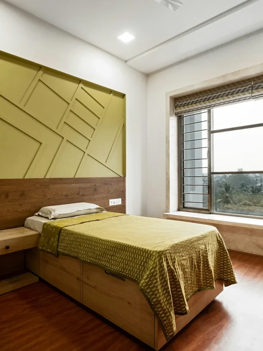
If the bed wall is panelled, papered or upholstered, choose the curtain after it, and take the curtain from it: a soft green curtain picked from a botanical wallpaper, a stone curtain beside an oak-panelled wall, a clay curtain against a terracotta headboard. Our article on bedroom wall design covers the wall side of that decision, and our headboards can be made in a fabric chosen with the curtains.
When the curtain and headboard share a fabric, the room looks tailored and calm, but it can feel heavy in a small bedroom. A common alternative is the same colour in two textures: a smooth velvet or cotton on the headboard and a slubbed linen at the window. With mostly white bedding, almost any curtain colour works; with patterned bedding, a plain curtain in one of its quieter colours keeps the room from feeling busy.
- White walls, timber headboard: warm stone or sage curtains, white bedding with one coloured throw
- Pale green walls: oat or clay curtains rather than a matching green
- Patterned wallpaper behind the bed: a plain curtain in the paper's background colour
- Upholstered headboard in a strong colour: curtains a step lighter in the same family
- Dark panelled bed wall: pale, textured curtains to balance it
Colours that last on east- and west-facing bedroom windows
Bedroom curtains often stay closed through the day, which means the lining and the leading edges take years of direct sun. The Canadian Conservation Institute notes that light fades colour, that ultraviolet mainly yellows and weakens fibres, and that the total dose is light intensity multiplied by time. An east window that gets clear sun every morning from November to April adds up to a large dose.
The Institute classes dyes by lightfastness on the ISO Blue Wool scale, from 1, the most sensitive, upwards, with each grade two to three times less sensitive than the one before, and it notes that most plant-extract dyes are highly sensitive. In practice, ask for the fabric's lightfastness grade before choosing a strong colour, prefer synthetic or solution-dyed fabrics for the sunniest bedroom windows, and always line them. The lining takes the direct sun; the face fabric lasts much longer.
Mid-tones hide the fading that does happen. A pale neutral fades towards a slightly paler neutral and no one notices. A saturated red or navy fades in stripes along the folds that face the window, and it shows. If you love a strong colour in a sunny bedroom, consider putting it on a headboard, cushions or a throw, away from the glass, and keep the curtain one step quieter.
Testing samples at night, with the lamps on
Most people see curtain samples in daylight and live with the curtains mainly at night. The Canadian Conservation Institute gives about 3,000 K for a typical warm-white lamp, against 5,000 to 6,500 K for daylight. Under warm lamps, colours shift towards yellow: rusts and clays glow, warm neutrals look richer, and cool greys and blues can turn flat or slightly green. A grey that looked crisp in the showroom can look muddy beside the bed at night.
So test samples in the bedroom with your own lamps. Pin a large sample at the window and look at it from the bed with only the bedside lamps on. Then look at it again the next morning with the sun behind it. If it looks right both times, it is the right colour. Our curtain simulator is useful for narrowing the choice beforehand, and for trying lined and layered versions on your own window before samples arrive.
If you are deciding between two close shades, choose the slightly warmer one for a bedroom lit by warm lamps, and the slightly cooler one for a bedroom that takes hot afternoon sun. When you are ready, our blackout curtains can be made in any face fabric you choose.