 Drape Haus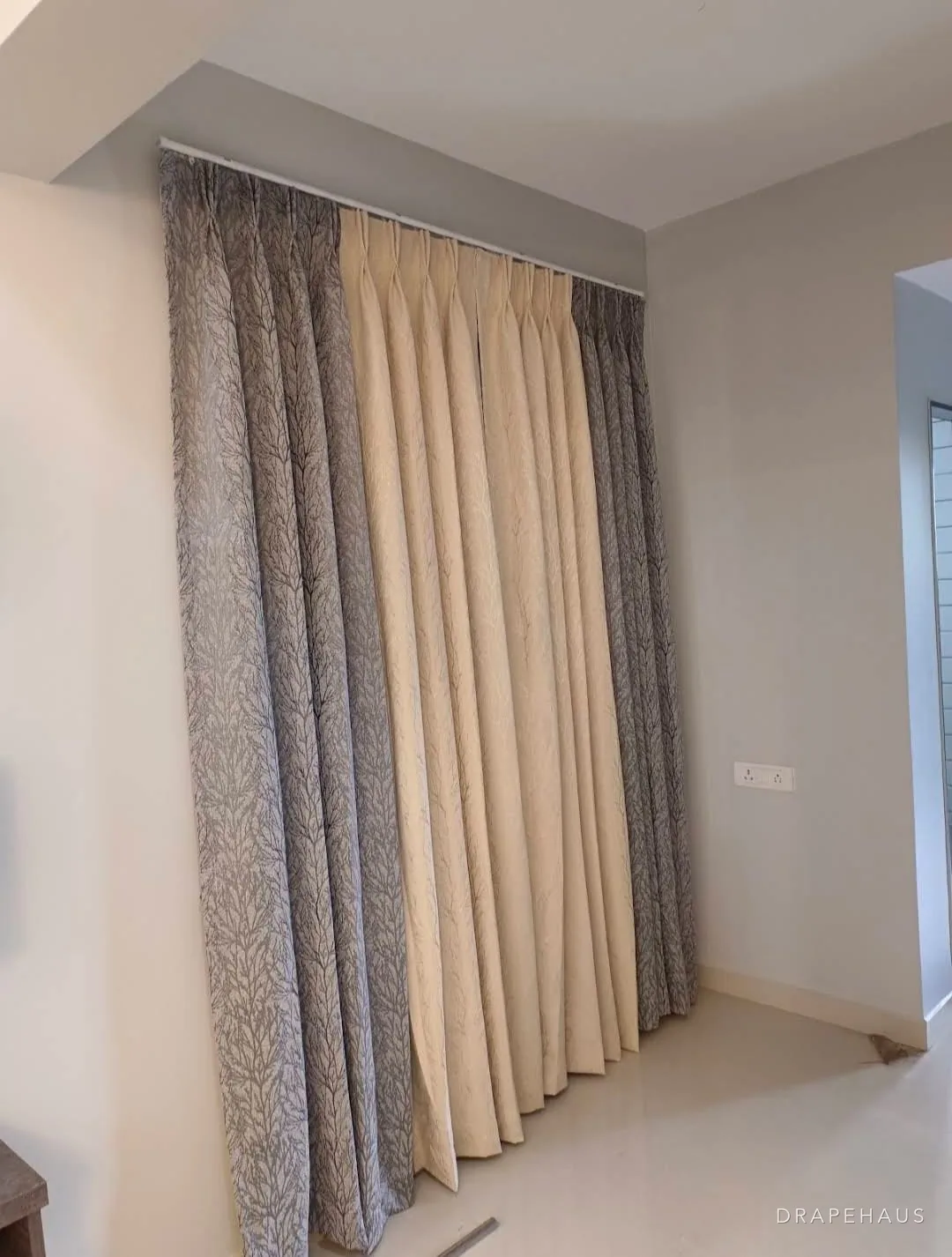
To choose curtain colour well, decide in this order: what the curtain has to sit with, which of three approaches you want, how the colour behaves in your light, and how long it will survive the sun. Most disappointments come from skipping one of those steps, usually by choosing from a small swatch in a showroom and seeing the full curtain for the first time in a west-facing room at four in the afternoon.
The three approaches are simple. You can blend the curtain into the walls so the window reads as part of the room. You can contrast with the walls so the curtain becomes a frame. Or you can pick up an accent from something already there, such as the sofa, a rug or a painting. Each works; each suits different rooms.
What makes Goa different is the light. Strong, clear sun from November to May fades sensitive colours fast and changes how every shade looks through the day. This guide covers the method, the light and the fading, and ends with how to preview colours in our curtain simulator before you ask for samples.
Start with what will not change
Before looking at a single fabric, list the things in the room that will outlast the curtains: the floor, the walls, the window frames and doors, the large furniture and the view. In many Goan houses that means a red or black oxide floor, terracotta or patterned tiles, teak or painted frames, white or coloured walls, and a view of green, of sea, or of the next building. The curtain has to work with all of them.
Then think about scale. A pair of floor-length curtains on a wide window is often the biggest single area of colour in the room after the walls and floor. A colour that looks charming on a cushion can dominate at three metres high. If you are uncertain, choose the curtain one step quieter than you first wanted and put the stronger colour in cushions, a throw or a rug, which are easy to change.
Finally, look at what the window looks onto. A garden view is already a strong green; a curtain in a warm neutral or a soft green frames it. A sea view is a changing blue-grey; soft blues, sands and stones sit with it. A view of a blank wall or a busy road is a reason to make the curtain itself more interesting, through colour, pattern or texture, because you will see more of it.
Three ways to choose: blend, contrast or accent
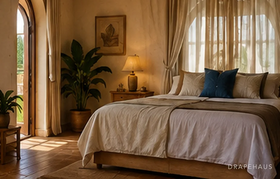
Blending means a curtain within a shade or two of the wall colour, usually a little deeper. It makes a room feel larger and calmer, hides awkward window positions and suits small rooms, rooms with many windows and rooms where the furniture or art should lead. Its risk is flatness, so it relies on texture: a slubbed linen, a basket weave or a fabric with a soft sheen keeps a tone-on-tone room alive.
Contrast means a curtain clearly darker or lighter than the wall, or in a different colour family altogether. It frames the window, makes a tall opening look taller and gives a plain room structure. It suits rooms with one important window, high ceilings, and simple walls. Its risk is that every window becomes a feature, which can feel busy in a room with five of them.
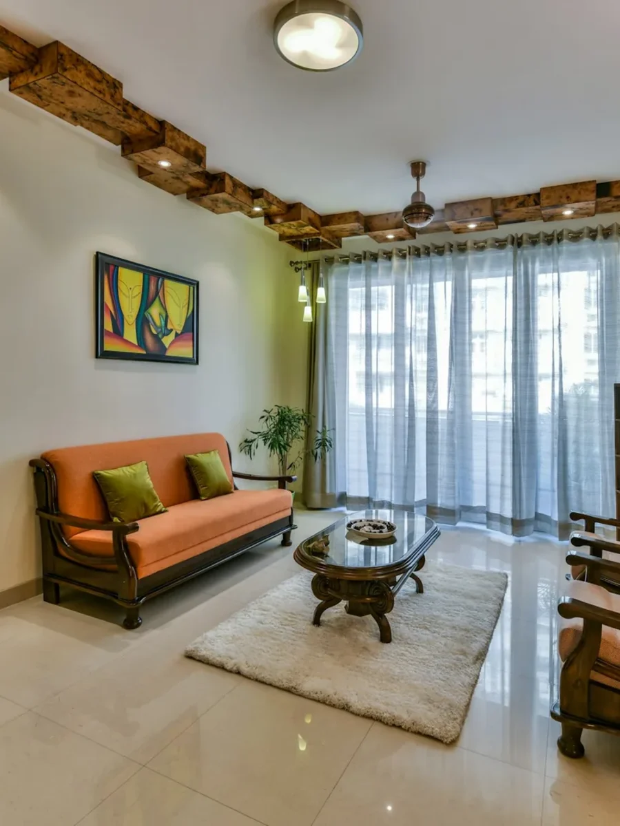
An accent means taking a colour that already exists somewhere in the room, in the sofa, a rug, a painting or tiles, and repeating it at the window. It ties the room together and is the easiest way to make a new curtain feel as if it belongs. Choose the accent from a large, permanent piece rather than from a cushion you might change next year.
| Approach | What it does | Suits | Watch for |
|---|---|---|---|
| Blend with walls | Window recedes; room feels larger and calmer | Small rooms, many windows, art-led rooms | Flatness; use texture |
| Contrast with walls | Window becomes a frame; adds height | One key window, tall ceilings, plain walls | Busy look where there are many openings |
| Accent from the room | Ties the scheme together | Rooms with a strong sofa, rug or tiled floor | Matching too exactly; go a shade lighter or darker |
Planning something like this?
We visit homes across North and South Goa, measure on site, and bring samples to see in your own light.
How daylight and lamps change a colour
The same fabric looks different at different times of day because the light itself has a colour. The Canadian Conservation Institute lists typical colour temperatures: around 3,000 K for a 'warm white' lamp, around 4,200 K for 'cool white', 5,000 to 6,500 K for daylight, about 6,000 K for noon sunshine and 9,000 to 12,000 K for blue sky. A low number looks yellowish, a high number bluish.
In practice, a north-facing room lit mostly by sky light makes colours look cooler and greyer. A west-facing room in late afternoon makes them warmer and more saturated. At night, warm lamps push everything towards yellow, which flatters reds, rusts and ochres and can turn a cool grey-blue muddy. During the monsoon, when the IMD's climate summary for Goa records skies around six to seven eighths covered from June to September, the light flattens and dulls most colours for weeks at a time.
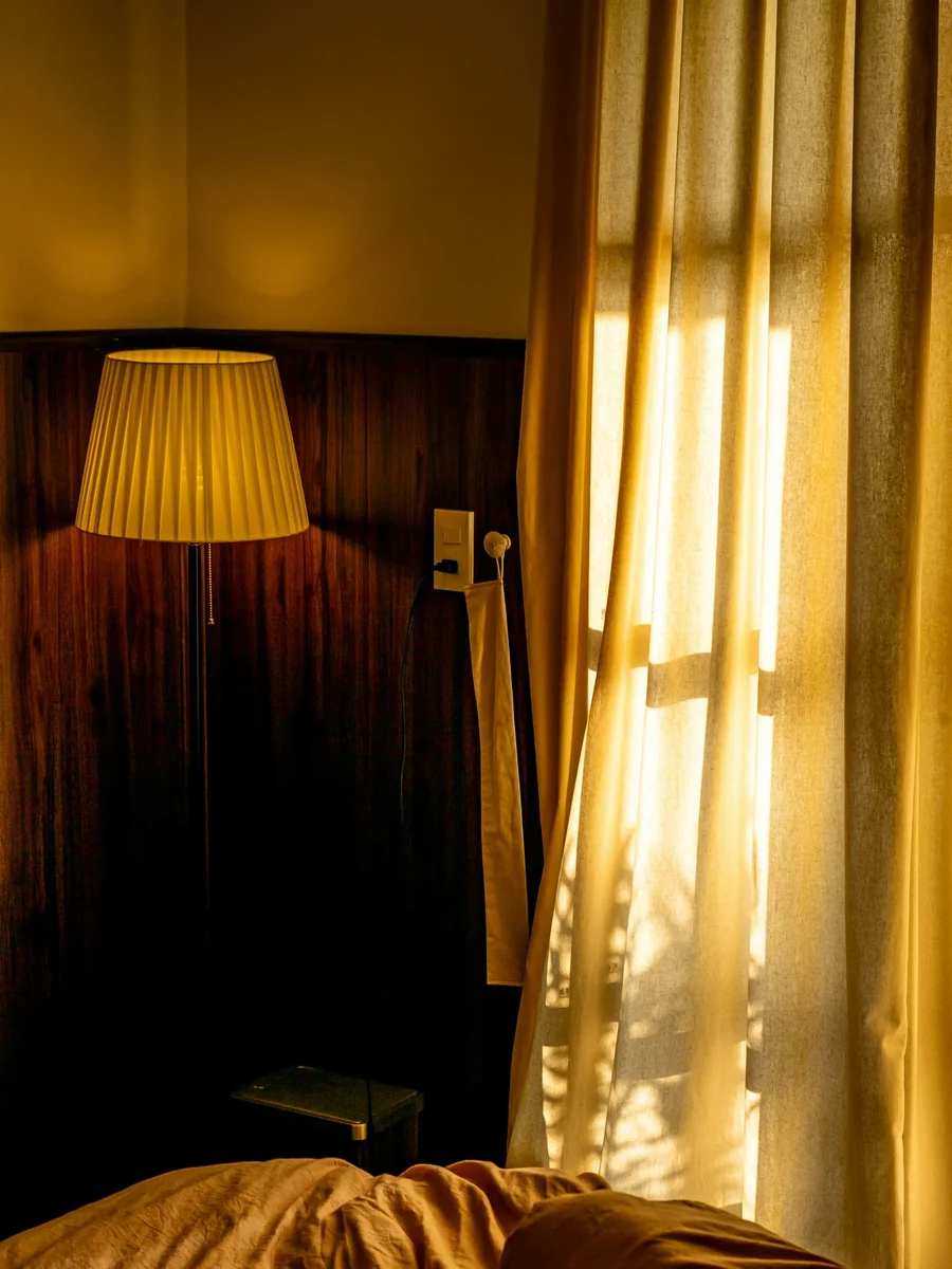
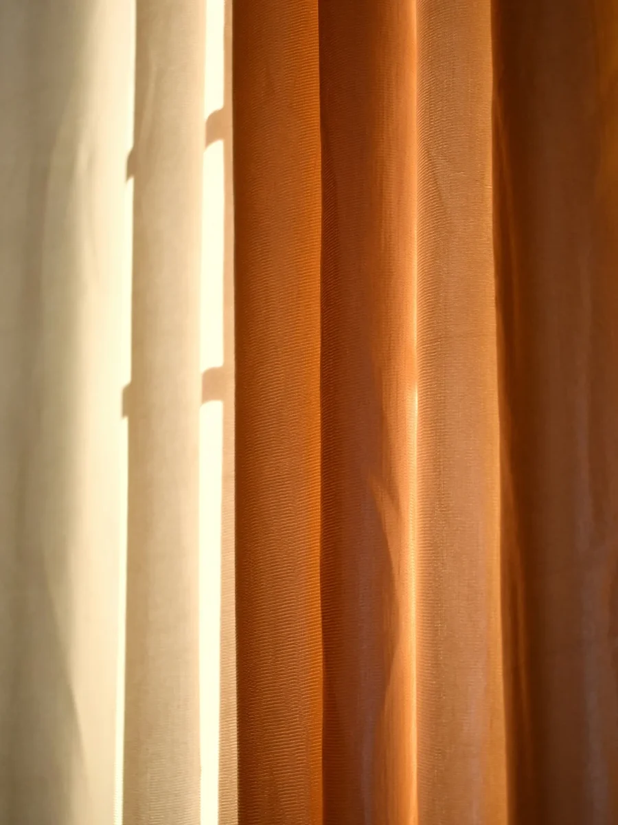
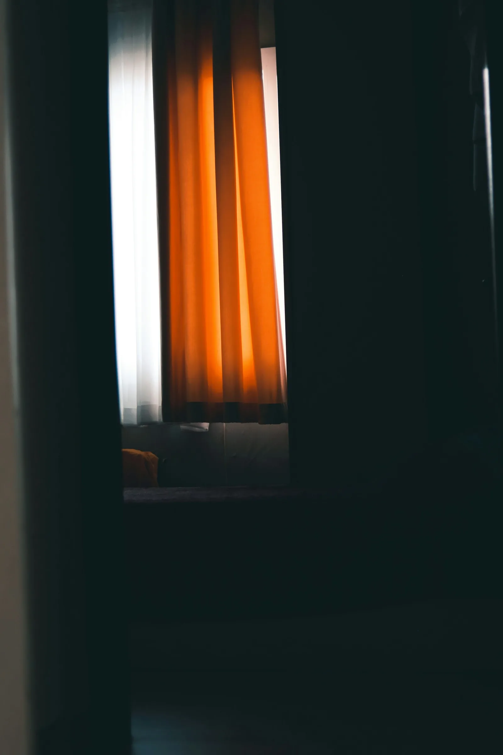
There is also the light that comes through the curtain. An unlined or lightly lined curtain, drawn across a sunny window, fills the room with its own colour: a saffron curtain turns the afternoon gold, a blue one makes it cool and slightly grey, a red one can make a white room pink. Hold a sample against the glass with the sun behind it, not only flat on a table, before deciding.
Look at every sample three ways: in morning light, in late-afternoon light, and at night under your own lamps.
Which colours fade first, and how fast
Light fades colour; ultraviolet mostly yellows and weakens the fibre. That is the Canadian Conservation Institute's summary, and it adds a point many people miss: for colours that are sensitive to light, blocking ultraviolet alone does not stop fading. Only reducing the light does. A UV-filtering film on the glass helps the fibres but will not save a fragile dye in direct sun.
The Institute groups colourants by sensitivity using the ISO Blue Wool standards, the industry's lightfastness scale, where each grade from 1 to 8 is about two to three times less sensitive than the one before. Grades 1 to 3 count as highly sensitive, 4 to 6 as medium and 7 and above as low. Its table shows how much this matters at the window. In average daylight of about 30,000 lux, eight hours a day, a highly sensitive colour can show a just noticeable fade in one day to two weeks, a medium one in two weeks to a year, and a low-sensitivity one in six months to ten years.
The colour name tells you less than the dye. The Institute notes that most plant-extract dyes, which produce yellows, oranges, greens, purples, many reds and blues, are highly sensitive, which is worth knowing if you love naturally dyed or hand-printed fabric. Modern synthetic dyes vary widely. So for a sunny window, ask for the fabric's lightfastness grade, choose the highest you can, and plan a lining and, ideally, a sheer in front of the glass to take the direct sun. Our guide to fading and sun damage covers fibres and dye methods in more depth.
Uneven fading is what shows. The leading edge of a curtain and the folds that face the sun go first, so a strong, flat colour can end up visibly striped while a mid-tone or a textured weave hides the change. That, rather than any rule about particular colours, is the main reason mid-tones and woven textures last better in Goan light.
| Light sensitivity | Blue Wool grade | Just noticeable fade |
|---|---|---|
| High | 1–3 | 1 day to 2 weeks |
| Medium | 4–6 | 2 weeks to 1 year |
| Low | 7–8 and above | 6 months to 10 years |
Colour and heat: what faces the glass
Curtain colour affects heat, but the colour that counts is the one facing the window. A dark fabric hanging unlined in the sun absorbs a great deal of energy and warms the room behind it. A light lining reflects part of the sunlight back out through the glass. The US Department of Energy's guidance says a drapery's effect on heat depends on its weave and colour, and cites studies in which medium-coloured draperies with white plastic backings reduced heat gain by 33%.
So you do not need to choose pale curtains for a hot room. Choose the colour you want facing the room, and make sure the lining facing the sun is white or light. It is the same lining that protects the face colour from fading, so one decision does two jobs. Our article on heat blocking curtains goes further into what actually keeps a room cool.
Working with Goan backdrops: white walls, oxide floors, teak
White walls look simple and are not. A pure white curtain against a warm, lime-washed wall can look bluish, and an ivory curtain against a bright optic-white wall can look dingy. Match the undertone first: warm walls take warm whites, creams and sands; cool walls take crisp whites, greys and blues. Our guide to white curtains deals with that choice in detail.
Oxide floors are a strong colour that many people forget to count. A red oxide floor brings a lot of warmth into the room, so a curtain that repeats some of it, in brick, rust or terracotta, looks settled, while a cool lilac or icy blue can fight it. A black or charcoal oxide floor is neutral and makes almost any colour look richer. Patterned cement tiles are best treated as the room's pattern; a plain curtain in one of their colours lets them lead.
Teak and other dark timbers in doors, frames and furniture are the other constant. Warm neutrals let the wood glow, and deep greens and indigo set it off well; a curtain in almost the same brown as the timber tends to make both look dull. Exposed laterite or stone walls bring texture and a warm red-brown that suits natural linen, ochre and olive.
- Warm white or lime-washed walls: ivory, sand, oat, warm stone, or a soft clay
- Cool or bright white walls: crisp white, pale grey, slate, soft blue
- Red oxide floor: brick, rust, ochre, olive, or a neutral with a warm undertone
- Black or charcoal oxide floor: almost anything; deeper colours look richer
- Patterned tiles: a plain curtain in one of the tile colours
- Dark teak joinery: warm neutrals, deep green or indigo, not a matching brown
Pattern, the size of the window, and previewing before samples
Pattern is colour with an added question of scale. Large prints suit tall windows and big rooms; small, busy prints can look restless at full height. Vertical stripes add apparent height, while a wide horizontal band near the hem can anchor a tall curtain in a room with a very high ceiling. If you want pattern but are nervous about it, a plain curtain with a contrasting border or a woven texture is a quieter way in. Our printed curtains page covers how repeats are matched across widths.
Before ordering samples, narrow the field. Our curtain simulator lets you photograph or choose a window and try colours, linings and layers on it, which makes it easy to rule out the colours that clearly do not work. Bring the shortlist, three or four at most, to the sample stage.
Then ask for large samples, not thumbnail swatches, and pin them at the actual window for at least a day. Look at them in morning light, in the afternoon sun from behind, and at night with your lamps on. If a colour still looks right at all three times, it will look right as a curtain. If the window takes direct sun, ask about the lightfastness grade and the lining before you commit.