 Drapehaus
Drapehaus
Preparing the room
Drapehaus
Preparing the room
Curtains
Botanicals, stripes, ikats and small geometrics — a printed curtain gives a room its personality in one move. The trick is choosing a print that works with the floor, the furniture and the view rather than against them.
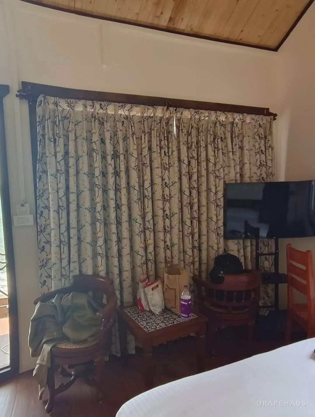
Lined · Midday
Treatment
Time of day
A lining protects the face fabric from sun and salt, and makes the curtain properly private at night.
In short
By the Drapehaus studio · How we write
Is it right for you?
Printed curtains are the most direct way to give a room its personality. A large window is often the biggest single surface in a room after the walls and floor, and putting a pattern on it sets the tone for everything else: the colour of the cushions, the weight of the furniture, even the mood of the light when the curtain is drawn.
They suit rooms that are otherwise calm — plain walls, simple floors, solid upholstery — and rooms that benefit from a strong identity, such as a guest suite, a dining room or a child's bedroom. In rental villas, a well-chosen print also makes each room memorable and hides the small marks of heavy use.
They are harder to get right in rooms that already have patterned tiles, busy rugs or strong wallpaper, and in rooms where you expect to change the scheme often. There, a plain or textured curtain with a patterned trim or cushion may carry the colour with less risk.
The details
We help pick scale first: a large print wants a tall window and a quiet room, a small repeat suits a busy one. Patterns are matched across widths so the print runs unbroken across the whole curtain, which is where a made-to-measure curtain looks noticeably better than a ready-made one.
Printed fabrics are usually lined — it protects the print from sun and stops the pattern showing through back-to-front from outside.
Your options
Printed is a broad term. How the pattern is made affects how crisp it looks, how it wears and how it responds to sun and washing.
Swipe for all 5 →
The honest view
Gives a room its identity
A printed curtain sets the colour and character of a room in one decision. It is often easier to build a scheme outward from a good print than to find a print for a scheme already fixed.
Hides wear and marks
Pattern disguises small stains, fading and handling marks far better than a plain colour. In busy rooms and rental suites this is a real practical advantage.
Adds interest to plain architecture
A room of plain walls and simple windows gains depth and focus from a pattern at the window, without the permanence of wallpaper or painted decoration.
Coordinates other fabrics
The colours in a print give a natural palette for cushions, upholstery and trims, so the room hangs together without effort.
More fabric for matching
Pattern repeats must be matched across widths and between curtains, which uses more fabric than a plain. Larger repeats mean more allowance for matching.
Harder to change the scheme
A strong print commits the room to its colours. Repainting or changing furniture later can leave the curtains looking out of place.
Surface prints fade unevenly
Printed colour, particularly on the surface of the fabric, can fade faster on the parts of the curtain in direct sun, making folds and edges show a different shade.
Side by side
Pattern can come from the curtain fabric itself or from details around a plain curtain. The choice affects cost of change, wear and effect.
| Printed curtain | Woven pattern | Plain with patterned border | Plain with patterned cushions | |
|---|---|---|---|---|
| Impact in the room | High | High, textured | Medium | Low to medium |
| Fade behaviour | Can fade unevenly | Fades evenly | Border may fade first | Curtain fades plainly |
| Shows pattern from outside | Blocked by lining | Often visible | Blocked by lining | No |
| Ease of changing scheme | Hard | Hard | Moderate | Easy |
| Fabric used for matching | More | More | Little | None |
| Hides marks | Very well | Very well | Partly | Poorly |
Swipe to compare →
If you are unsure about committing to a print, a plain curtain with a printed leading-edge border gives pattern at a lower risk.
Rather see it in your own room?
We bring samples to the house, measure every window, and specify for the light and exposure you actually have.
Room by room
A calm printed curtain can be the room's main feature. Choose a gentle scale and palette so the room remains restful, and line for darkness on sunrise-facing windows.
Prints suit children's rooms well and hide marks. Choose designs that will not date too quickly and a lining that can be detached for washing.
A dining room is used in bursts and often in the evening, which suits a bolder print. Plan the pattern to read well both drawn and open.
Works well in rooms with plain upholstery and floors. On large runs of glass, a large-scale print needs careful planning so the room does not feel dominated.
Prints give each room a character guests remember and disguise wear between refreshes. Choose light-fast fabrics and hard-wearing base cloths.
A busy print in a working room can be distracting, especially behind a screen or in the background of video calls. Keep prints small, quiet and away from sightlines.
In depth — tap a heading to read
Matching across widths is the start, not the end, of pattern work. We also decide where the motif sits vertically. On a large botanical, a full flower or leaf should appear at a comfortable eye level and be complete at the hem, rather than cut off abruptly. On a stripe or check, the pattern should land at the same point on every curtain in the room so the tops and hems align.
Printed fabrics are also sometimes printed slightly off the grain. If the curtain is cut to the grain, the pattern will slope; if it is cut to the print, the fabric may twist as it hangs. We inspect every length before cutting and decide, window by window, which gives the straighter result. Fabric that is badly off-grain goes back.
Repeat type matters. A straight match lines up horizontally across widths; a half-drop repeat shifts by half a repeat. Half-drops use more fabric but read more naturally on large, organic designs, which is why many botanicals are drawn that way.
A curtain is rarely seen flat. When drawn back, the fabric folds into a stack and only the outer faces of each fold show; when closed, it hangs in soft waves. A small repeat stays legible in folds; a very large motif may only ever be seen in fragments. Before choosing a large print, we hang a sample in the folds of the heading you have chosen.
Heading type changes this further. A wave heading presents broader, even faces of fabric and suits large patterns; a tight pinch pleat folds the fabric more and can break up a bold design. For prints you really want to see, slightly lower fullness on a wave heading shows more of the pattern while still hanging well.
A printed curtain drawn back into a narrow stack becomes a column of colour beside the window. It is worth imagining the room that way too, as the curtain will spend much of the day open.
Judge a print both flat and in folds. The folded view is how you will see it most of the time.
The print should relate to the room's other patterns rather than compete with them. A useful rule is to vary scale: pair a large curtain print with small-scale or plain upholstery, and a small curtain print with larger, bolder elements elsewhere. Two patterns of the same scale fight for attention.
Colour can be drawn from the print into the rest of the room — a cushion picking up one colour, a trim picking up another — so the curtain looks like part of the scheme rather than an addition. In coastal houses, printed curtains in softened natural colours often sit better than hard, saturated ones, which can look harsh in strong light.
Think about how the pattern reads from the garden or the lane too. A lining conceals the print from outside, which keeps the façade of the house calm even when every room inside has a different pattern.
Surface prints are more vulnerable to sun than the base cloth. On a west-facing window, the parts of a printed curtain that sit in the sunlight fade first, and the folds that stay shaded keep their colour, which can make the fabric look striped when drawn. A lining protects the back, but the face of a drawn curtain still meets the light, so choose light-fast prints for sunny rooms.
Base cloth matters in humidity. Prints on cotton and linen carry those fibres' sensitivity to damp; prints on polyester or blends are more stable. For printed curtains in houses near the sea or closed through the rains, a printed polyester or blend is the safer foundation.
Living with it
Some prints tolerate washing; many are safer dry-cleaned. The care depends on how the colour was applied, which we note when we specify the fabric.
If washing at home, test a hidden corner for colour run first. Deep reds and indigos are the most likely to bleed.
Swapping left and right curtains occasionally spreads sun exposure and slows uneven fading.
Before a closed season, clean, dry and store printed curtains in breathable bags away from light, which can fade folded edges.
Avoid these
A small cutting says little about a large repeat. Ask to see a full repeat, ideally hung at the window.
Large repeats need extra fabric for matching. Ordering by plain metreage leaves widths that cannot be matched.
A large print curtain beside a large print sofa makes both look busy. Vary the scale between patterns in the room.
Unlined prints fade fast on sunny windows and show backwards from outside. Line printed curtains in almost every case.
Checklist
More in curtains
Curtains measured on site, cut to the window and specified for what it actually faces — from airy sheers on a veranda door to full blackout in a bedroom that catches the sunrise.
From the Journal
All articlesOur process
One team from the first visit to the last bracket, so nothing is lost between the person who specified it and the person who fits it.
FAQ
It depends on scale and what else is in the room. A large print on a tall window in a calm room looks deliberate; the same print in a small busy room can overwhelm. We look at the room before recommending one.
Lining protects the print from fading and stops the pattern showing through as a reversed, blurred image from the street.
Well-chosen patterns never really go out of style. Botanicals, stripes, ikats and small geometrics have lasted for generations. What dates a room is usually a print chosen purely for novelty, or colours that clash with the rest of the scheme. Choose pattern that relates to the house and it will age well.
Consider the height of the window, the size of the room and the other patterns present. Tall windows and calm rooms suit larger prints; smaller rooms and busier schemes suit smaller repeats. Seeing a full repeat hung at the window is the most reliable test.
Often, yes, because printed colour sits closer to the surface than dyed colour. Screen and woven patterns tend to be more light-fast than some digital prints. Lining the curtain and choosing fabrics with a good light-fastness rating slows the fading considerably.
Yes, if the two patterns differ in scale and share a colour. A small wallpaper motif with a larger curtain print, or the reverse, can look deliberate. Two large, competing patterns usually overwhelm the room. We look at both together on site before recommending a combination.
It is the distance after which the design begins again, measured down the fabric and sometimes across it. The repeat determines how much extra fabric is needed to match the pattern across widths and to align it at the same height on every curtain.
Next step
Pattern is easiest to judge in the room itself. On a home visit we measure each window, look at the floor, walls and furniture, and bring prints and woven patterns to hang at the glass. We check scale, colour and how the design reads in folds, then plan the placement and matching across every width. Our workroom cuts to the pattern and lines each curtain so it lasts. Book a home visit to explore the options with us.